Testing GitLab CI

During my internship this summer I found myself pining for a continuous integration server. The project I was working on had a massive set of Cucumber tests. The only problem was that they took 40 minutes to run completely, which is a bit too much of a pain to actually run them regularly on a local machine. Last semester for my software engineering group project, we were given Jenkins servers to run our tests on - this enforced the habit of keeping the tests up to date and fixing anything that breaks them.

I started looking around out of curiosity to see what else there was apart from Jenkins, which was not the most friendly thing to set up at the start of the project. After a little search I came across GitLab CI which integrates right into GitLab (obviously) and is written in Go which makes it quite cool right off the bat.

GitLab CI can be the simplest build server that you could imagine - it can be easily set to just run a shell script when a commit is pushed, and if the exit status is zero it succeeded, if it’s non-zero then it failed. This basically means that you don’t have to learn a new configuration syntax to do anything (you can, but it’s definitely not needed). If you can run your tests from the command line, you’re good to go.

Once it has been set up, every commit to the repo will trigger a build on your server and the result will be displayed in the ‘builds’ tab of GitLab and when you view the commit. This can be done with either GitLab.com or a different hosted instance of GitLab.

Full installation instructions for CI Runner are on GitLab’s website. However it’s as simple installing a package and running the setup (Instructions for Ubuntu, other distros on GitLab’s website)

# Add the source to apt-get:
curl -L https://packages.gitlab.com/install/repositories/runner/gitlab-ci-multi-runner/script.deb.sh | sudo bash
# Install the runner package
sudo apt-get install gitlab-ci-multi-runner
# Run the setup
gitlab-ci-multi-runner register

The instructions say to run the last command with sudo, but when I did this my config file was set to be in /etc/gitlab-runner/config.toml rather than the expected ~/.gitlab-runner/config.toml.

The register command sets up a runner to point to a certain GitLab url (either GitLab.com or your custom instance) and the token needed to pull your code. I setup mine with:

URL: https://gitlab.com/ci
Token: ~~ secret token ~~ # Accessed in the main project settings
Description: Test runner
Executor: shell

I made a quick branch on one of my projects that has fair number of unit tests that are easily run. All I had to do was add a .gitlab-ci.yml file:

maven-package:
  script: "mvn package -B"

maven-package is the name of the build process, and the script key denotes either a single bash command or a list of commands. Once this was pushed to GitLab a build immediately started.

And failed instantly. Thankfully a full log gets output to the web interface and I could see that the runner was getting confused trying to load up a Docker instance, even though I didn’t configure that. So once I’d found the config file location (which wasn’t where I expected, as I mentioned before) and deleted all the entries apart from the main [[runners]] section (getting rid of the [[runners.docker]] section probably would have been enough). Once I’d made this change the build completed successfully.

Right now I’m very impressed with the ease of setting up a GitLab CI Runner and will definitely use one in the future (especially if I get a scooter computer) for the odd occasion that I write unit tests. However if I did set up a CI server I would want to make sure the gitlab-runner user had as few permissions as possible - probably only able to read or write within their own home directory - so that the chance of breaking my setup is reduced.


4K Video Editing on a 12" MacBook?

4K Video Editing on a 12” MacBook? →

Of course the difference between Final Cut on one platform vs cross-platform Adobe Premiere is making the main difference, I think this really illustrates the advantage of software running on hardware that it’s expecting.


Welcome to Swift.org

Welcome to Swift.org →

Swift is now open source!

Finally I can start having a more serious look at making something with Taylor and deploying it onto something other than my laptop. At work this morning I downloaded the Swift binary and fired up the REPL. Fully functioning Swift on Ubuntu. The future is now.

Perhaps more interesting than the actual Swift repository is the Swift Evolution page that publicly shows the features and direction that both Apple and Swift community want the language to head in. It makes me very excited to see speed, portibility and API design among the goals for version 3 and beyond. This could mean more consistent APIs and a global Foundation library that wraps the native functions for each system (at the moment pre-processor commands are needed to use platform-specific libraries) which is not very Swift-y.

The first commit to the Swift project is dated July 18, 2010. It’s crazy to think that this was kept completely secret for four years before it was unveiled. Also pointed out in the comments is that Swift was named Swift since its inception.

Along with the dump of projects released this morning is the Swift Package Manager. I am probably far too excited about this that it is normal to be for a tool that I haven’t really looked at yet. However because of the pain that CocoaPods has caused me while trying to write unit tests that access a database, I’m happy to see a first party solution - and will be updating my version of SQLite.swift as soon as I can.


Life with Swift

Since Apple introduced Swift at WWDC last year, I’ve been interested in it as a compiled language that seems as easy and quick to develop as a dynamic scripting language like Python. Especially that Swift will (hopefully) be open sourced late this year, meaning that it could be used to develop applications that could be deployed easily onto a webserver as a simple binary (no Capistrano necessary).

Swift’s basic syntax is incredibly clean and easy to get your head around. Keywords take second place to syntactic symbols - extending a class is done with a colon: class Subclass: Superclass, Protocols {} rather than the more verbose Java syntax class Subclass extends Superclass implements Interfaces {}. I like this both because of the reduced typing but also how the colon is reused to set the type in all instances where a type is needed.

var str: String // variable initialisation
func things(number: Int) // argument definition

This is not the case for return values though. It would make sense that like a variable, a function should have a type attached to it. This is not the case, instead a one-off symbol is used: func getNumber() -> Int {}. This would be nicer and more consistent if it used the same style: func getNumber(): Int {}.

Swift’s optional types are very convenient and make code more explicit - being forced to unwrap values that could be nil makes writing code that deals with user input or stored values a whole lot cleaner. For example if you read a number from a text field and need to turn it into an int, Int(myString) returns an optional int, it may or may not be nil. You can then unwrap it:

if let number = Int(myString) {
    // Do something with the number
}

This is really handy, and extends to almost all parts of the language and the Cocoa API. This can be further enhanced by using optional chaining - adding the ? operator on to the optional value allows you to call methods on optional values as though they were definite values. The value returned by the last method is always an optional if you do this. For example if you have a dictionary of strings and you want to get one lowercased.

let lowercased = myDict[key]?.lowercaseString

Where this falls down is if the key is an optional value as well - you can’t index a dictionary with an optional value if the key isn’t optional. What I would like to do would be to use the question mark to maybe unwrap the key, and if it isn’t nil, then use the key to look up an item in the dictionary. Like this:

let value = myDict[key?]

But you can’t do that. The closest you can get is something like this:

if let k = key, let value = myDict[k] {
  // value is a definite value that is in the dictionary
} else {
  // either key is nil, or there is no value in the dictionary to match it
}

What makes Swift that bit cooler than other languages that I’ve dabbled in is that it has the standard functional programming functions - map, filter, and reduce - which makes working with arrays a whole lot less cumbersome for anyone with a bit of functional programming prowess. Paired with the powerful closure support, it’s easy to express an operation in terms of a few closures. To turn a list of strings into a list of all the ones that can be turned into ints you can just map and filter them:

let nums = myStringList.map({ str in
    Int(str)
}).filter({ possibleInt in
    possibleInt != nil
})

To sum these you can use the name-less closure syntax:

nums.reduce(0, { $0 + $1 })

None of this would be possible without Swift’s type system. When first looking at Swift I thought that it was simply statically typed like Java, except you didn’t have to explicitly declare the type of variables - they would be set for you if the compiler could work it out. However Swift can behave somewhat like Haskell’s types to create functions that don’t just work on on a string or a number, but any type that implements a certain protocol.

In Haskell you might come across something like:

isSmaller :: (Ord a) => a -> a -> Bool
isSmaller a b = a < b

Which uses the orderable (Ord) type class to declare a function that can be used on any type that supports ordering - strings, characters, numbers, etc. Swift has an expanse of built-in protocols that let you do similar things. For example, I wanted to be able to do set operations on lists while keeping the order of the elements, so I made an extension that would extend an array of elements that implemented the Hashable protocol - meaning that the contents of the array could be put into a set.

extension Array where Element: Hashable {
  func unique() -> [Element] {
    var seen: [Element:Bool] = [:]
    return self.filter({ seen.updateValue(true, forKey: $0) == nil })
  }

  func subtract(takeAway: [Element]) -> [Element] {
    let set = Set(takeAway)
    return self.filter({ !set.contains($0) })
  }

  func intersect(with: [Element]) -> [Element] {
    let set = Set(with)
    return self.filter({ set.contains($0) })
  }
}

These functions will be added to any array that contains elements that are hashable - if they aren’t, then I simply can’t use the functions. The more I get used to things like this, the more I like programming in Swift. It successfully combines the things I like in many different languages into one - it’s compiled, quick to write, allows for functional programming as well as rigid object-oriented structures and the ability to extend the language itself seamlessly.


Not Enough Magic

There were some minor murmurings this week after Apple released their new peripherals - The new (Magic) Trackpad, Mouse and Keyboard. (This was mostly drowned out by the far more significant news that the new iMac has a platter HDD). A very vocal portion of the internet were outraged that the Magic Mouse has a charging port on the bottom:

Magic Mouse with port on bottom

It’s easy to quickly dismiss this as a stupid decision and go about your day. But the mouse is supposed to charge enough for 8 hours of use in one minute or overnight for three months of use. This means that you will only ever see it awkwardly upside down charging less than 2% of the time - and when you’re using it the other 98% of the time you will be magical mouse that has no visible charging port. Had Apple opted to place the port on the front, the upper glass surface wouldn’t be able to dip down nearly as far as it does on the current and previous models. It also saves the mouse from having a little pointy nose/ mouth at the front - which would have made the previous model look far better in comparison.

Yesterday the batteries in my keyboard ran out, and so I had to stop using my computer and wait for them to charge overnight (Or bring out my classic wired keyboard, but that’s a bit too far). It would have been great to be able to simply plug in whatever device is running out of power for literally one minute and be able to continue working as normal. Having in-built batteries also means that remaining charge estimates can be far more accurate - my keyboard and trackpad have no idea whether they have 1.5V AAs or 1.2V rechargables, meaning that the drainage percentage is almost always off.

What the real concern should be with these new peripherals is what the lifetime of the batteries will be. Coupling the battery to the device means that as the battery degrades the device becomes more and more painful to use. You shouldn’t have to buy a new keyboard because your old one can’t keep charged any more. I own three wireless input devices, all of them over 6 years old. This isn’t a problem for this generation of devices because their batteries are replaceable and it’s just a matter of clicking a new set in.


OS X El Capitan

El Capitan default wallpaper

On Thursday I bit the bullet and trashed my home data cap by upgrading to El Capitan. The 6 GB download crawled down at a snails pace overnight, but when I got up in the morning my MacBook was waiting for me with a new version of OS X.

At first look, El Capitan appears no different to Yosemite - it has the same window styles, menu bar, and login screen. For me, the most notable change is the new Mission Control layout. Instead of showing the bar of desktops along the top with a thumbnail, there is just a thin list of labels. When you move your mouse close to the top of the screen this will expand into a set of thumbnails. Once it has been expanded it will remain so until you exit Mission Control. Much like the dock, I find it to always appear when I want it to, and as a spaces ‘Power User’ I have not been frustrated by this at all.

Along with the new Mission Control there is of course split view. This only works on applications that can be freely resized - MailBox will not split, but editors, terminals and browsers all split just fine. Windows can either by split by dragging the window into an already full screen application in Mission Control, or by clicking and holding on the green fullscreen button before dragging the window to either the right or the left - once that window is split you can select the window that will occupy the other half of the screen.

The whole splitting process seems a bit janky - press and hold doesn’t feel quite right on a trackpad (My guess is that it’s designed to be Force Touched) and once two windows are split together, you can’t substitute one with another application without exiting the split and then re-adding the new app. Neither Apple’s nor Microsoft’s can be said to be better, it entirely depends on how the user ‘maps’ its functions in their mind as to which will be more useful for them.

When I set out to do some work, I was glad to see that Ruby and related gems, Python, Brew, Java, MySQL and Postgres all made the transition without any immediately visible issues. This is usually the factor that makes me wait before upgrading. My development setup wasn’t completely untouched though - it appears that the way fonts (or at least monospaced fonts) are rendered has changed, so that the text appears to be thinner in most cases. In IntelliJ it looks like someone turned of LCD font smoothing off (it is still turned on in Preferences). In both TextMate and the Terminal it is better looking. I’m yet to find out if this is a system-wide change that effects all fonts or just my editor font of choice Anonymous Pro behaving badly.

Rummaging through the preferences, I only found one notable change - it is now possible to auto-hide the menu bar (General -> Automatically show and hide the Menu Bar). After turning it on for two seconds, I am of the opinion that this is an awful feature that no one should use.

El Capitan is definitely worth the upgrade for the sake of being up-to-date and brings some nice features to make the download worth the wait.

If you want a more Siracusian review, Ars Technica has picked up John’s baton to prove a more in-depth look at the latest iteration of OS X.


Absurd infinitum: Deliberately misunderstanding Steve Jobs

Absurd infinitum: Deliberately misunderstanding Steve Jobs →

It would seem that some people do not understand the difference between wanting to wear high heels to a weekend wedding and having to wear them all day every day at your job at the cranberry farm.

Excellent point that Apple hasn’t blown the iPad Pro by selling a stylus Pencil.


Learn Enhancer 1.6

Exam season has started, so naturally I’m looking at any excuse to either not study. Today I had another look at my Chrome extension: Learn Enhancer. I made this so when I look at a set of lecture notes instead of showing the content in a tiny frame in the page it would expand it to fill the page. All it does is look for a certain element on a page (an iframe with a pdf in it) and redirect you to the url of the pdf document. All in all it’s about 10 lines of javascript.

It works amazingly well for files that are embedded, but some lecturers like to mark their files as ‘force download’. For normal people I assume this isn’t much of a problem, but whenever I go looking for a file that comes from Learn my downloads folder isn’t the first place I look, so I typically end up with duplicates of duplicates clogging up my downloads.

Instead of changing my habits (or studying for discrete math like I was meant to) I had a look into what causes a browser to download a file rather that display it. There are a number of ways that you can do this; in HTML 5 there is a download flag that you can add to a link that tells the browser to download it - but only if that browser is Chrome, Opera or Firefox. Moodle (aka Learn) is firmly rooted in the ’00s and so this wasn’t being used - if it was then it would be trivial to remove that flag from certain links.

Next up was the content-type of the request - if it is set to application/x-forcedownload then the browser will save it. Sure enough the response from Moodle came back with content-type: application/x-forcedownload. All I had to do was change that and then I would be happy. My first thought was using javascript to make an ajax request and then pipe the data back into the DOM as a PDF, a quick test and a load of ascii on my display I reconsidered.

Another option would be to make a proxy that would get the data and then send a new response back with a brand new header, but a quick wget showed that Learn checks for a cookie when you try to get the file. Plus it would be really slow and require a server just to run this silly script.

Eventually I realised that I wasn’t limited to the functionality of javascript - this was going to be part of an extension, I can use chrome APIs to intercept and modify data! Sure enough there is a method that allows you to pick up responses, modify the header, and then give it to Chrome to use. Perfect.

Enter content-disposition. It turns out that the content type isn’t the only thing that determines if the file should be displayed or downloaded. content-disposition allows you to specify that the file is an attachment and it should have a certain filename. Some more Google-fu and I changed this to inline and bam, inline PDFs with no forced downloading.

I also took this opportunity to use another cool feature in Chrome extensions; as well as having a javascript content script that is injected into all pages, you can have CSS that is injected as well - so now any styling that irks me can be gone in a flash of display: none;

If you do use Moodle or Blackboard on Chrome, you can download Learn Enhancer to ease your eyes.


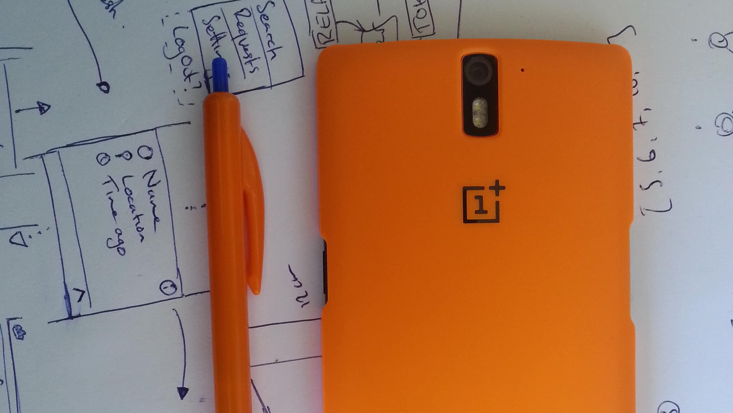
The OnePlus One

The OnePlus One

The One is truly a bargain. At USD 350 it is less than half the price of comparable phones such as the HTC One (2014), the Samsung Galaxy S5 and the Nexus 6. Most phones that hit a price point this low have noticeable compromises: the Motorola cut down the specs and build of the Moto G and E, Google’s Nexus 5 is lacking in storage and you can feel the plastic when you hold it.

Sporting all the same numbers as competing phones frmo 2014, the One could match any phone in an arms race; a 5.5” 1080p screen, Snapdragon 801 processor, 3GB of RAM and 16 or 64GB of internal storage. Nothing here will make or break the One - if you’re buying a high-end phone these are the numbers that you should be expecting.

What makes the One a cut above any other budget phone is that it feels incredibly solid - when you hold it you can feel that the phone is weighty, solid, and won’t bend. On the 64GB black version the back is made of a ‘soft-touch sandstone’ material - it really does feel like you have a very high-grit piece of rock in your hand. I hate it. It’s not comfortable and I get the feeling that it would rub off in my pocket or wear it’s way through the lining of my jeans. Which is why I’m very glad I got the incredibly stylish orange case, which I have used from the moment I took it out of the box. The case makes the back feel more like the 16GB white version, or what I would imagine a matte plastic MacBook would feel like.

The design decision that irks me the most is the two-stepped forehead and chin. The edge of the screen stops 1 mm short from the top and bottom of the phone, leaving the faux-metal band that wraps around the edge in between the screen and back cover visible. It doesn’t look terrible but after a few hours of sitting in a lint-y pocket it gathers specs of dust that doesn’t easily wipe off because of the sharp corner. By no means a dealbreaker but irritating none the less.

The reason that I wouldn’t recommend the One to anyone is the software experience. Almost all Android phones have a serious case of Worse Products Through Software. Right now it comes with Cyanogenmod 11S, which is based on Android 4.4 Kitkat. Which was released in late 2013. There is apparently an OTA update that will bring Android 5.0 Lollipop to the One, but this didn’t appear on my device - another irritation.

The poor software situation is almost entirely down to the abysmal wreck that is Cyanogen Inc. They had originally agreed to update the One for at least a year, but one thing led to another and Cyanogen is partnering with Microsoft and OnePlus is building their own ROM.

This may all make sense for someone who reads tech blogs all day and has some understanding of the politics of the deals involved, but for most people they will just be annoyed that they got this phone and it’s now running an 18 month old version of Android and could stop getting updates. (It’s more likely that they don’t know/ care that Kitkat is out of date).

So because I mainly bought this phone to jump onto the material design/ lollipop bandwagon (and I couldn’t wait for an OTA update to appear) I jumped through all the correct hoops and installed Oxygen OS - OnePlus’s own ROM made specifically for the One. It does what it says on the box: it’s stock Android Lollipop with a few minor changes to take advantage of the One’s features (e.g: tap to wake).

After finding the Google Play Services Wakelock Fix and setting the screen’s DPI from 480 (the default, stupidly huge) to 400 (normal size), I think I can fairly safely say that so far the One is a solid piece of hardware that is held back from the mass market by the whim of Cyanogen. I imagine that the Oneplus Two will be better, more expensive and hopefully see a solid release of Oxygen OS.

And hopefully they continue to support the One.


Nexus 6.5

I thought I’d share my 100% true, completely accurate rumours that I came up with about Google’s next iteration of the Nexus lineup.

Made by Motorola

Every manufacturer chosen to make a phone for Google has done so on a two year contract - HTC made the G1 (not really a Nexus) and the Nexus One, Samsung made the Nexus S and Galaxy Nexus, LG made the 4 and 5. There seems to be no reason why Motorola wouldn’t make another Nexus device, especially because their design and lack of bloat line up with Google’s ideal for Android, making them an ideal Halo product manufacturer.

5.5 - 6” QHD+ Screen

Everyone needs more pixels, and Google will give them to you. Nexuses have always been fairly far forward in the push to have as many pixels as possible. Samsung is rumoured to have a 4K display on it’s Note 5 - giving it a theoretical pixel density of 770ppi. I wouldn’t be remotely surprised if the next Nexus had a 4K display, however I think that it’s more likely to stay QHD this year.

Google will likely push the large phone (phablet) category again, meaning that the screen will be 5.5 - 6”, I’d guess that it won’t stray over 6”. To differentiate this from the Nexus 6 they might push to minimise the bezels as much as they can, a movement I can get behind.

Fingerprint Scanning Dimple

It was expected that the Nexus 6 would have a fingerprint reader to match the iPhone and Galaxy S5, so it’s more than likely that this year will be the year of fingers on Android. Stock Android devices have the disadvantage of lacking any obvious way to read a fingerprint when they are woken up because of their lack of a home button. The only other reasonable places you would put it would be on the power button (which wouldn’t get any significant area of the finger scanned) of the back of the phone, where your finger might naturally rest while holding the phone - ie Motorola’s signiture dimple location.

USB C

Obviously.