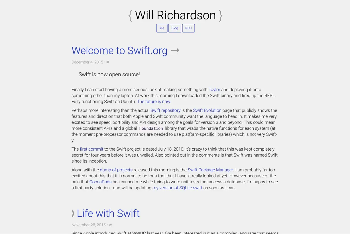
My website is now ten years old!
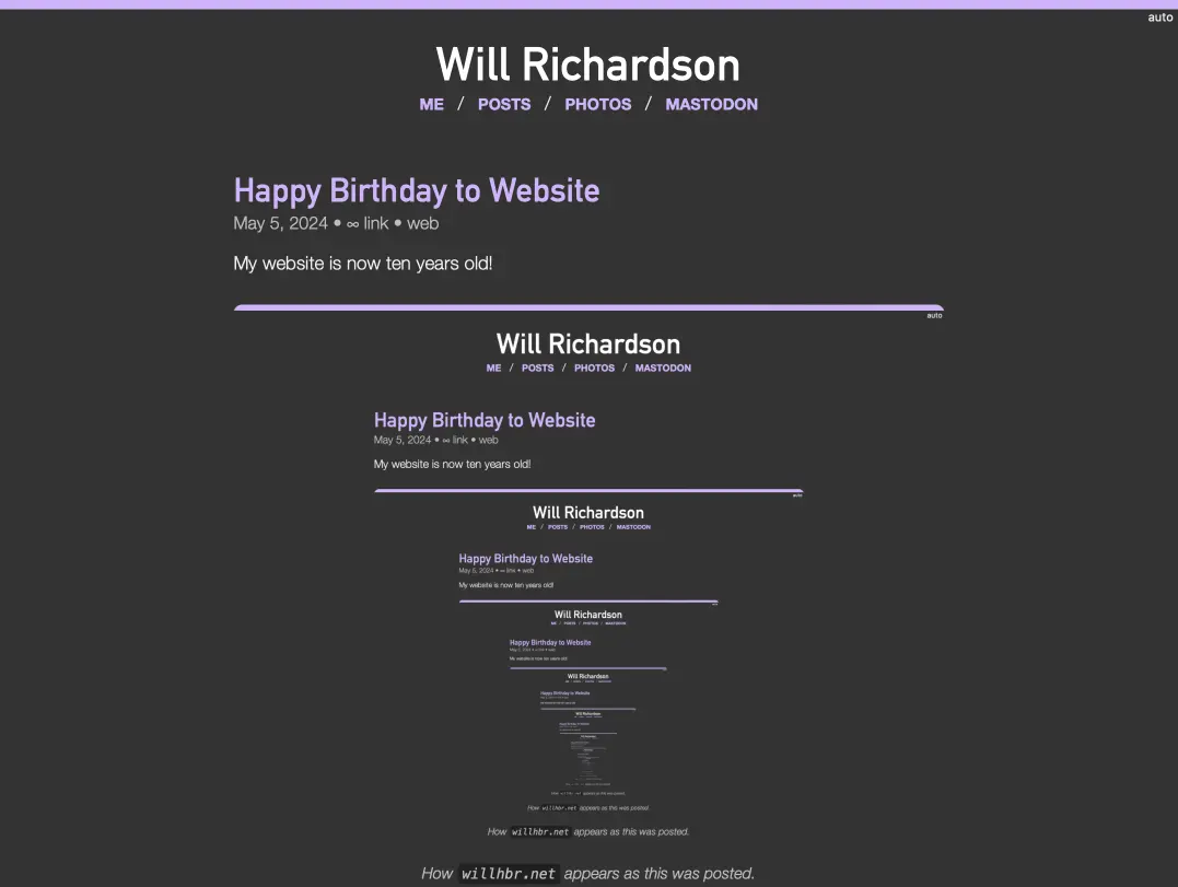
How willhbr.net appeared as this was posted.
Ten years ago today I made the first commit to this website, consisting of just an index.html with the contents:
<p>Sup.</p>
Thankfully it didn’t stay like that for long (just over three hours) and soon after I committed a simple “about me”-style homepage:
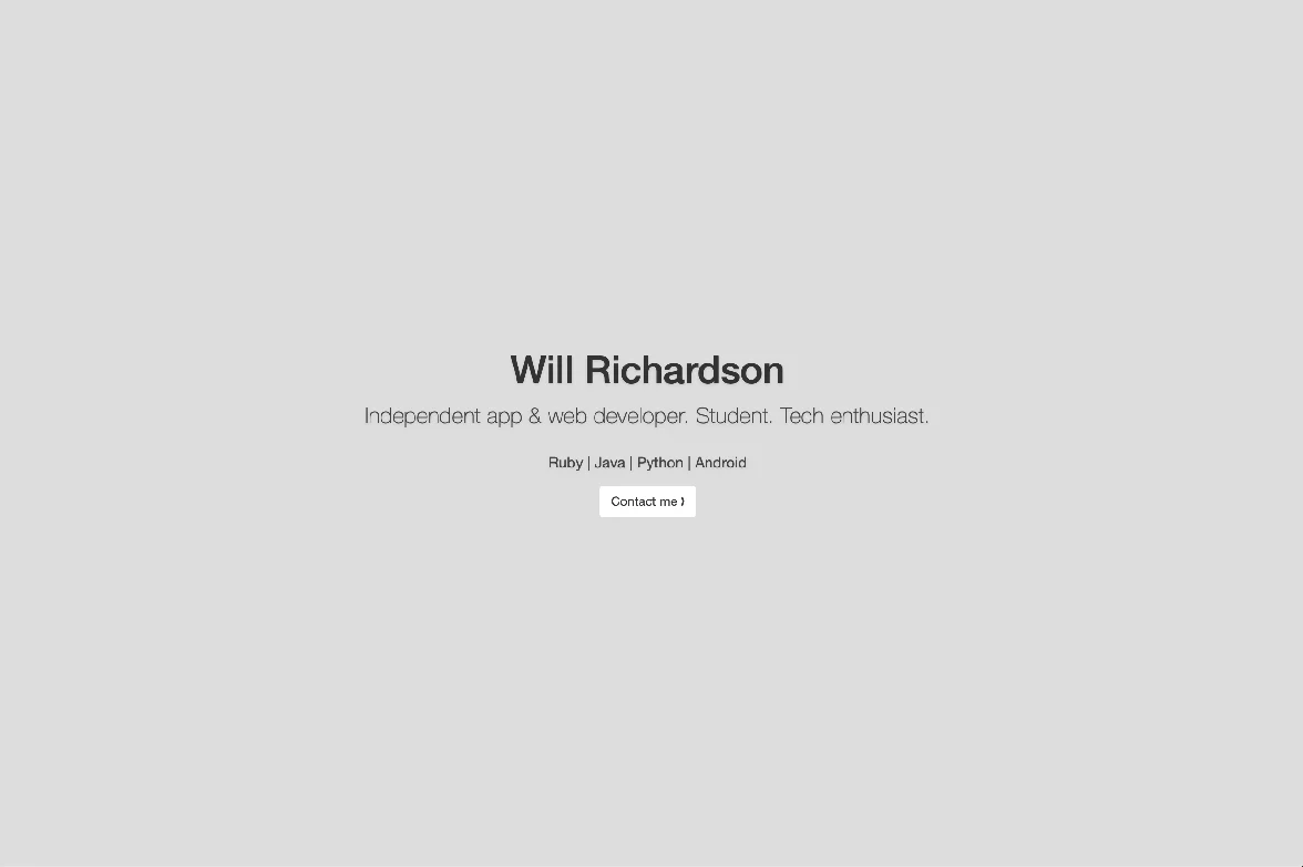
Hilariously this included adding the entirety of Bootstrap just to get that div centred, and loading jQuery just to expand a section when you click the button.
It was a few months later in late 2014 I added Jekyll and wrote my first post. This started out as hiding behind a /blog URL, but later moved onto the main page. I refuse to link to any old posts directly because that’s just embarrassing.
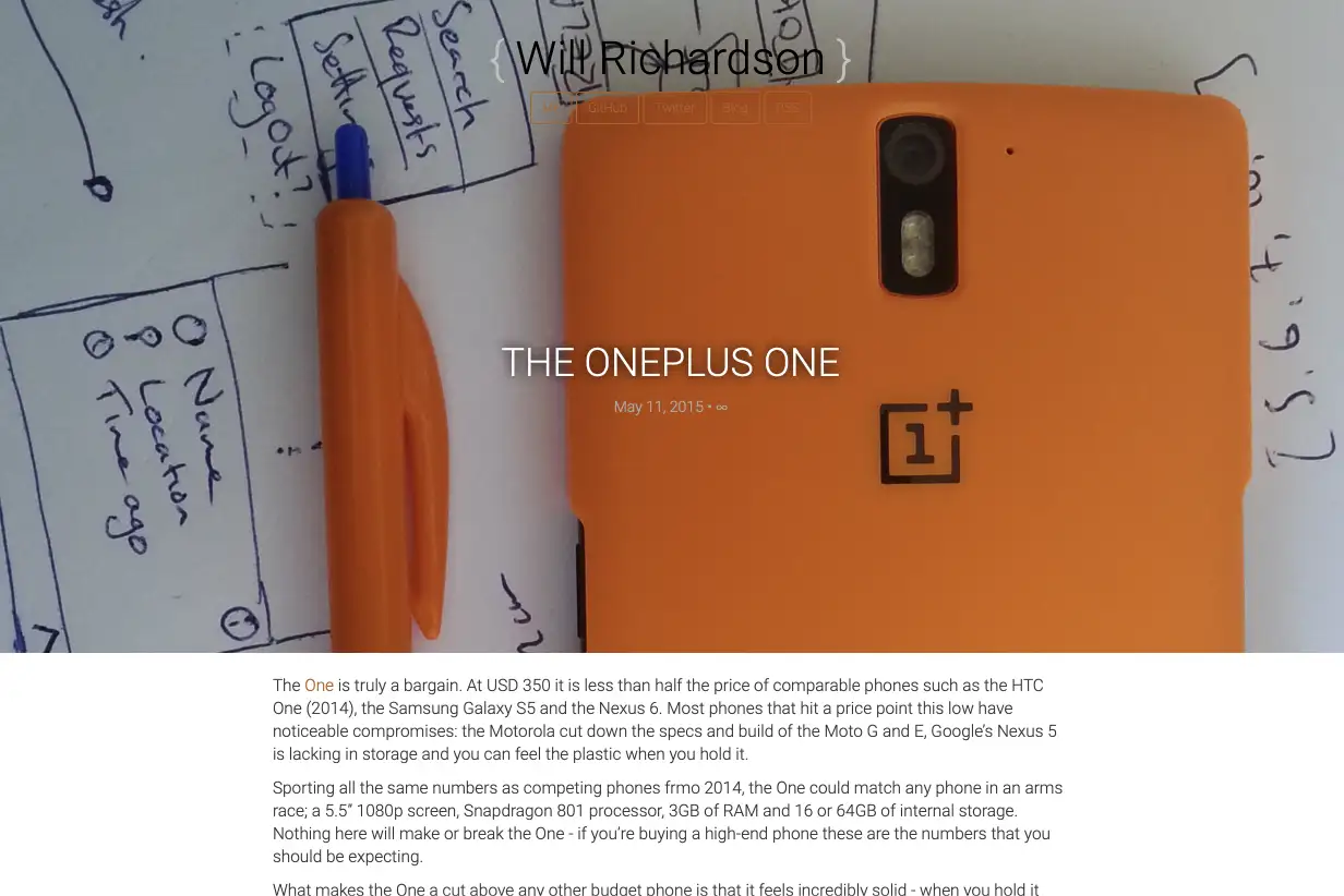
In 2015 I spruced up the design and added this photo of my shiny new OnePlus One:
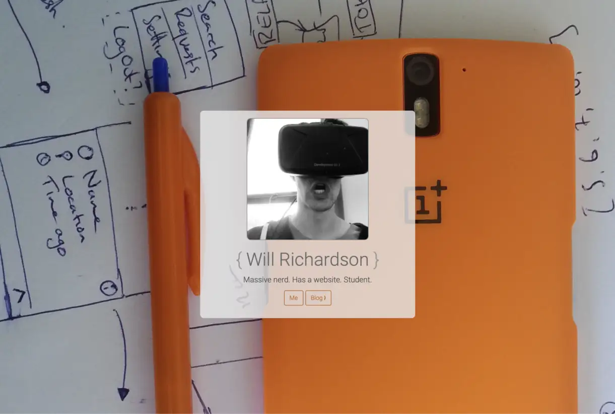
Yep that’s me using an Oculus DK 2.
Big images are super cool, for ages I have wanted to have that cool layout where the images extend to the full width of the page but the text remains in a narrower centred block. I don’t have enough CSS enthusiasm to implement this, and I don’t post enough images to make this worthwhile. The main reason I’ve ended up back with an image-less layout is that even on a reliable, high speed connection it can take the best part of a second to load the image. That’s not too bad for small part of the page, but when it’s taking up the whole page it’s super jarring to have it pop in after the rest of the page has loaded.
I did have big fancy images for a while, but ended up giving up on it. It’s also a lot of effort for something that is basically invisible in a mobile layout.
Who needs any kind of readability or contast!
It’s amusing that the basic layout and style of my site were locked in at not too long after I setup Jekyll. Big title of my name at the top, subtitle (since removed), and a few links. Posts had a big coloured title, with some basic metadata below.
A substantial part of this design is that I have limited enthusiasm for complicated layouts that change substantially with screen size. Most of my web development experience was just before everyone started looking at everything on their phones. My site layout doesn’t require any @media queries to change based on viewport width, it’s max-width and margin: auto doing all the heavy lifting.
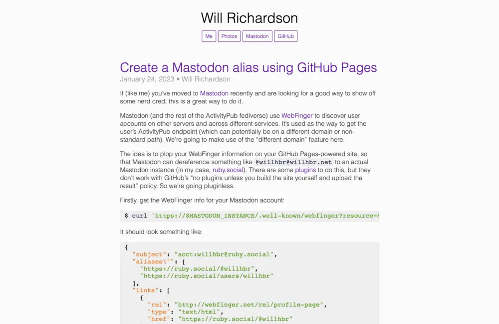
The website in early 2023, after I settled on purple but before I started endless tinkering.
There’s definitely an aesthetic that I’m following of “technical personal website/blog” that’s typically shades of grey with a single highlight colour, default sans serif font, minimal layout complexity. I’m definitely influenced by the sites that I follow, as well as the ease of implementation.
The goal is to make all the information a reader might want as available and obvious as possible. The text of the post is right there—that’s the main thing. If someone decided to use a reader mode on my site I would consider that a design failure. Post metadata (most importantly the date, but now also tags) is clear right under the post title. I’ve definitely come across posts with no obvious date and been unsure if it’s still relevant, or maybe if it just needs to be read in a different mindset. This is especially true for technical writing, where things change somewhat frequently. If your writing is timeless, I would forgive you for omitting the date. But I do think you should still include it for completeness.
Last year I added some more links at the bottom of the post: next and previous, links to the archive, RSS Feed, and my Mastodon account. When I come across an interesting post I want to see what other things the author has written, so I made this easily accessible at the end of every post.
I would quite like to have links to related posts based on keywords or tags, but I don’t really have a big enough collection of posts for this to work super well, and I don’t do Jekyll plugins at the moment anyway. This might change as I play around with tags more.
In a bunch of places I have a link to the archive, which is a chronological list of every post on the site. Some sites have similar pages with just lists of months, each linking to the full content of the posts published during that month. I find this annoying. It’s hard to search for a particular topic or keyword as the post titles aren’t in the list, if you don’t know the exact month of a post you have to click through each page manually. It just pushes people into leaving the site and using a search engine with a site: filter.
I’m such a fan of the archive page that I try and slip links to it in as many places as possible. It’s in the site header1, the date on every post goes to the archive, there’s a link after every post, it’s next to the pagination links, and if you go to a page other than the first one there will be pagination at the top and bottom of the page (both with links to the archive).
Hopefully if you’re looking for something I’ve written, skimming the archive will find it.
Picking an accent colour is tricky, if you look throughout the history of the site I’ve dabbled in blue, teal, green, Ubuntu-flavoured orange/brown, and now purple. It’s hard to not just fall back to using blue for everything, and I’m really happy with the purple accent—both in light and dark mode. I think of the dark mode as being the canonical colour scheme, since I’m almost always writing something late at night.2
It’s hard not to use web fonts, since there’s basically no guarantee as to which fonts will be available on any particular system. Previously I did use Raleway but removed it was pointed out how the whole page “pops” when the font loads. Using Helvetica or the system sans-serif font is good enough, most systems have decent looking options3—and it’s probably a font that the reader is used to seeing.
Of course, I put all this effort in and then the best-case scenario in my view is that someone subscribes via RSS and never sees the site. Although there are some affordances that make the feeds4 friendlier. First is putting the whole post content in them—my posts aren’t too long so it’s not like the feed becomes unwieldy. I copied the idea of a feed-only footer after seeing it on Pixel Envy, it’s a really simple way to tell the reader “this is the end, there’s nothing more to read, you can leave now”. As a reader I never know if someone’s feed contains the whole post or if it’s just a snippet—it’s possible to get to the bottom and wonder if there’s something you’re missing. Writing well is another option, but I find that more difficult.
If you are going to just include stubs in the feed, then you should do a similar thing—put a “continue reading” link at the bottom of the entry. This makes it clear that you’re not just posting a one-paragraph quick thought, and it’s probably easier to click that link than rely on the feed reader UI to make opening the post in a browser obvious.
It’s especially annoying when a feed includes a few paragraphs, so you read that, wonder if you’ve got to the end, scroll back up to the top, open the post in the browser, scroll down again to find the point you’d read to, and then continue reading from that point. I don’t want to put anyone in that position.
Now for some indulgent behind-the-scenes details.
When I first made the site I was using TextMate for editing code and MacDown for markdown editing. Later, when I was doing things on my iPad I used Bear and then iA Writer, probably with some others in the middle. On the iPad I could just use Working Copy to push the changes directly to GitHub, but for some reason I absolutely must see the post as it will look on the site before I push it publicly. Seeing the post in a different context—not a syntax-highlighted, fixed-width markdown editor—helps spot mistakes, and gives me confidence I haven’t colossally messed up some markdown syntax or post metadata. I do the same thing when I’m sending code to be reviewed—I’ll look at the diffs in the terminal but then upload to a code review tool and immediately spot mistakes.
Running the website “locally” is actually running it on one of my home servers, so I’ve come up with plenty of mechanisms for getting posts from my iPad or Mac onto the server. Despite all my efforts, the easiest is still just to copy-paste into Vim.
Now that I’m doing everything on my Mac, I use MarkEdit after a brief dabble with Obsidian. I just keep drafts in my documents folder like the good old days. There’s a little helper script that deals with the front matter and file naming convention for Jekyll. Turning a human-readable title into a URL slug manually is just not a good use of energy.
What will the site look like in another ten years? Have I reached the optimal design, or has drudging through ten years of website screenshots inspired a proper redesign? Wait until 2034 to find out!
-
Only on the main page, if you’re on a different page then it just links back to the main page. ↩
-
Written at 10:22 PM. Side note, I don’t know how anyone uses MacOS in light mode, it’s so bright! ↩
-
Apart from Ubuntu Sans, I don’t know what it is but I always recognise it and that makes it stick out as “Hey I’m written like the ubuntu logo!”. Back in my day the Ubuntu logo was 100% curves. ↩