Samsung Copying Culture

On the latest Topical podcast Russell and Jelly discussed whether Samsung shamelessly copied the iPhone when they made the original Galaxy S, whether it was a smart business move that allowed them to dominate the smartphone market and if they deserve the bad rep they have for being the company that just copies everyones designs.

I’m going to preface this by saying that I have owned three Samsung devices - the Galaxy S, the 7-inch Tab 2 and the S3. The Galaxy S came already loaded with Cyanogenmod (I bought it second hand), the Tab 2 managed to keep TouchWiz on it for about 6 months before Cyanogenmod took the wheel, and my S3 managed about a day. This kind of sets the stage on my opinions of Samsung.

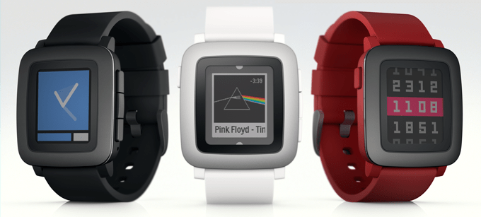
Jelly made the armgument that if the S had been designed like the S2 - with the slightly textured back and more prominant camera - then it would have been so easily mistaken for the iPhone. To be honest this would have pleased nerds slightly because they notice the subtle differences and know what to look for, but the general public don’t; I have been asked multiple times if my Pebble is an Apple Watch (Before the Watch was announced, let alone available) and friend was asked if his One Plus One was the iPhone 6+. To a nerd both of these are trivially easy things to differenciate between, but to most people if they hear about a new big phone by the fruit company then all big phones must be that one, and all geeky watches must be made by the fruit company too. So I think that any phone released after the announcement of the iPhone that used the ‘lots of screen and no buttons’ design would be assumed to be an iPhone by the general public.

What really makes me dislike Samsung’s phones and think of them as the cheap knockoff is their software. Now don’t get me wrong - I appreciate the contributions Samsung has made to Android, like notification panel toggles and this ringtone - but there are so many things that they have done just for the sake of it with no real reason. Almost every AOSP app has been replaced by an S-$APPNAME alternative that doesn’t have any outstanding features and looks downright ugly. One of the things that irks me the most is that the bottom border on a notification will not swipe away as you dismiss the notification and disappear when the notification is fully dismissed. It baffles me that weird behaviour like this is because of the crazy ‘improvements’ that Samsung adds, and isn’t in stock Android - reducing the already low level of polish and consistency in the OS.

Another thing mentioned in the episode is that when Samsung releases a new platform as a product (the example given was their cloud storage platform, S Cloud) they are ridiculed for copying Apple/ Google and not coming up with something original. There is a fairly good reason for this: most major companies are expected to have some kind of cloud service to integrate with their products on their platform. But Samsung doesn’t have a platform, or any original software products. The reason people buy Samsung phones isn’t because they can use S-$APPNAME but because they irrationally hate fruit companies but don’t know how to research Android phones, which I don’t blame them for - it’s a minefield of shortcomings. So Samsung having a cloud service doesn’t have anything to put it apart from its competitors - Google has Docs built right into Drive, Apple saves all your app data and by all accounts is fairly incompitent with its sync and Microsofts Skynet Skydrive integrates with all of Office. They all have characteristics and reasons to use them. Samsung has none of these that I can see, and so it seems a bit wasted.

Back to the Galaxy S, I think there was plenty of room for Samsung to differenciate itself from the iPhone, even if it was just ditching the physical home button in favour of capacitive buttons or onscreen buttons which have been the blessed design by Google since the Nexus One. Obviously copying the iPhone - or many aspects of its asthetic - worked for Samsung, earing it 24% of the smartphone market.

Do remember that I have a passionate hate for almost all of Samsung’s software and phone design, and wish that the people who sell second hand phones would get a better design taste.


Valve: Give me a Steam Machine

At GDC this month Valve announced that they will finally ship the Steam Controller and Steam Link later this year, opening up the possibility for third party manufacturers to ship their own Steam Machines with a Steam Controller. This again brought out a multitude of articles questioning who would want a Steam Machine; everyone who wants to game already has a gnarly PC and people that don’t want to set up a PC or want to play in their living room have a console. However ,I want one. I don’t have a console or a serious PC and I think there are plenty of people like me that could consider buying a low-mid range Steam Machine.

In the last year I got into some casual gaming on my laptop, starting with Valve’s own classic - Half Life - and then moving on to some GTA, Portal and Half Life 2. Even though these games are well aged, they still manage to push my wee MacBook Air a bit harder than I would like. What would be great is if I had some way of playing any game I wanted (within reason, I wouldn’t expect it to be able to push GTA V in VR or something crazy like that) without worrying about compatibility or performance.

Notice the key word I used there: compatibility. Buying an XBox One or PS4 today would mean I could play most games realeased in the next decade, but at the moment there are plenty of games I would like to play that are from the previous console generation, or even before that (Far Cry, the original GTA ‘trilogy’). For this there is little better than a mid-range PC, and while you’ve got that why not make your life easier [citation needed] and get a Linux based OS that is built for gaming: SteamOS? (Obviously if I wanted to play older games I would have to dual boot Windows, which would take away a lot of the streamlined appeal.)

So while everyone is ragging on Valve for introducing something that they don’t want to buy because they can’t imagine anyone without a beast of a gaming PC or a shiny new console, I honestly think that if SteamOS is picked up by some decent indie developers it could entice a lot of casual gamers.


Pebble Time

The new pebbles

A wee while ago I wrote a semi-review of the original Pebble Smartwatch after I splashed out and bought one (because why not?). I made some predictions of what I thought Pebble would and wouldn’t do with the next major iteration of the watch:

What I don’t think Pebble will do:

  • Color screen
  • Touch screen
  • Android wear OS
  • Higher price (Not much over ~$250)
  • One day battery life

I was fairly confident that the next Pebble would have some kind of voice input, making it more than just a second display for your phone.

Last week the Pebble Time Kickstarter went live as Pebble announced the next generation of Pebble: a colour-screened e-paper long-battery-lifed monster, a dramatic improvement from the original.

The Time has a colour e-paper display which is the same resolution (144×168px) and size of the original, meaning that all Pebble apps will work natively without any scaling. The resolution might not be much of an issue, as it displays 64 colours (compared to the 1 bit/ 2-colour black and white display) meaning there is an opportunity for anti-aliasing on the display if the processor can handle it. This is quite likely, given the quality and smoothness of the animations shown in the Kickstarter video one would hope that it’s going to be able to push around as many different pixels as you want.

Voice input is a nice feature - they could very well have skipped it and kept with the other improvements and the Time would still be a success. I don’t know how the implementation is going to work, as there is no nice API for ‘Send a text response back to the app that made this notification and let it handle the reply’ on either Android or iOS (Actually Android Wear might introduce some Intent/ BroadcastReceiver like this, which would be cool). Even if the functionality is limited to SMS initially, it would greatly improve the flexibility of the Pebble - far far past the 5 pre-set responses that are currently allowed.

The new ‘timeline’ style interface looks pretty interesting - I’m not that bothered with quickly changing watchfaces and would rather be able to cycle through useful information. It’s to early to say now as they haven’t really said that much about it. All I can say is that it better be reliable - I installed ‘3Calendar’ this week to get my timetable and… meh. It frequently doesn’t get my events, which is really frustrating and says a lot about where Pebble can go to improve their platform.

To be honest I am not a fan of the design. There, I said it. I like that on the original there is one piece of ‘glass’ (it’s actually plastic 😐) that covers the entire front of the watch, with no seams until you go over the edge (When you get over the edge it’s a shitshow of weird gaps and stuff). The Time, on the other hand (heh pun intended?) has the screen, then a black border, then presumably a bit of a seam and then a coloured border. I’m definitely not a fan of this look and would much prefer the black border went to the edge, as the coloured border doesn’t add functionally - the back of the watch is a different coloured material, so it’s not like it is a consequence of the construction (like the red band on the Nexus 5). I hope in the next revision when I’m thinking of getting a new watch/ phone, the design is more to my taste.

Despite the issues I have with my Pebble (Started screen tearing..), I can see myself remaining in the Pebble camp for quite a while - at least while I still use Android - as the functionality it adds (or any smartwatch adds) to my phone has become so ingrained into my use of the phone that I would feel a bit lost without it. Phones that make noises seem so 2000’s.


I made a thing

Last year I was tasked with creating a database-heavy Android app. The default Android SQLite database is pretty average - everything has to be done with raw SQL statements and the results are always Cursor objects, which aren’t the best things to deal with. Not wanting to deal with all that business (even though some aspects of the project ended up requiring it) I took a few hours and made the basis of what because a nice wee wrapper for the standard database interface.

I basically tried to replicate what Arel does, although without the magic that makes Arel a bit confusing (and hard to implement in Java). It allowed me to make the app fairly quickly worrying about any SQL insert or update statements - want to save something? Just use the .save() method, you don’t have to worry about whether it should insert or update.

One of the cool things that you can do that I didn’t design for is that the Record subclasses don’t have to represent a table in the database; As long as the query you send to the constructor has the correct column names the object will get set as expected. (Although like an SQL view, saving the ‘record’ won’t do anything).

I’ll try and keep it updated as I use it for new projects and add some features that I may need. If you’re looking for an easy/ lightweight way to manage a medium-sized database in your app, then I’ve got the thing for you!


Smartwatch!?

First to enter the foray of consumer-friendly wearable computing, the Pebble is the product of a highly successful Kickstarter project, raising over 100 times its goal. You know that though. What you don’t know, is how it works in the real world and whether it can replace your (probably empty) wrist.

What it does

Once you’ve got your pebble paired with your phone it will display one of the three default watchfaces (a word clock, a basic ‘analogue’ watch and a tacky-looking digital one). The Android app now has the option right out of the box to show notifications from your calls, texts, calendar, email & any other 3rd party apps. This works best with android 4.3+ so it can use the official notification API.

One slight hiccup with the notifications is that if you use an app like Hangouts for SMS, and have both SMS notifications enabled and Hangouts notifications enabled then you’ll end up getting double notifications (one set from Hangouts and one set from Pebble’s SMS setting). This can be fixed by disabling SMS notifications and simply using the notifications from hangouts as your SMS notifications. This isn’t difficult to do, but there are plenty of times where this can happen: I use Today Calendar, Mailbox & Hangouts so Calendar notifications, emails and SMS notifications have to be turned off or I get double-ups. Not a dealbreaker by any means, but not something your average user would do (More on that later).

The apps it comes with out of the box are fairly sparse: Alarms, Music, Notifications, Watchfaces & Settings. Alarms is a fairly basic setup: create/ edit alarms, change the snooze time. Notifications lets you see a stream of dismissed notifications. Watchfaces & Settings let you do some basic configuration of the device, including set up shortcuts to apps when you press and hold either the up or down button from the ‘homescreen’ (your current watchface). These are pretty useful: especially when you set one to open the music app.

The music app is almost worth buying the Pebble for. Yup, I did just say that: Neither of my headphones have play/ pause buttons on the cord, and so it is really neat to listen to a podcast and quickly pause it to talk to someone. Or change the volume. Or skip a section. I can even just plug my headphones in to my phone, press play on the Pebble and be listening to a podcast without even getting my phone out of my pocket.

This does come with a drawback of the native music app; it ties the controls to a single app (In my case I have it linked to Pocketcasts) which allows it to open the app if it is not already, and then start playing music. If you have Pocketcasts set as the app to control, and you’re listening to music on Spotify and you try to skip a track, the Pebble will send the command to Pocketcasts not Spotify. There are apps (MusicBoss) that you can use to improve the behaviour and make the pebble. I listen to podcasts most of the time so I just leave it on Pocketcasts and I’m happy.

Pebble 2.0: What I’d like to see

With the introduction of the Apple Watch and more Android Wear devices next year, Pebble will have to step up their smartwatch game to remain relevant. With no input method the Pebble remains to be a status display with hotkeys for your phone.

What I don’t think Pebble will do:

  • Color screen
  • Touch screen
  • Android wear OS
  • Higher price (Not much over ~$250)
  • One day battery life

Each one of these would bring the Pebble to a playing field where it is directly comparable to other smartwatches, which isn’t where Pebble will want to be: they need to separate themselves, and the easiest way to do this is to tout their far superior battery life (10 days guys! 10 days!) and “no-fuss” attitude.

However no voice input will be a dealbreaker for the massive smartwatch market (Still not convinced on this wearable business) as many people will just see that one can and the other can’t and put their money where the features are. What Pebble could do is build in a bluetooth headset into the watch (Think Motorola Hint) so that the heavy lifting of voice recognition is done by the phone, not the watch. If they pulled it back even further and made it push-to-talk the battery life could possibly still stay at a ‘Pebble acceptable’ time.

‘Always on’ voice recognition driven by the phone could be a marketing nightmare because it would depend fully on the chipset in the phone that it is paired with - ie no iPhones and only a couple of Android phones (Motorola is the only company that seems to be doing this well as far as I can remember) - meaning that the general public won’t be seeing the features they’d hoped for.

Should your mum get one?

Unless your mum is a massive nerd, then no. The pebble still has some weird connectivity issues that can’t be solved by simply pressing a ‘reconnect’ button - every few days it gets sad and disconnects itself so thoroughly I have to go into the bluetooth settings on the watch, remove my phone from the list of known devices and then try and reconnect. That sometimes works.

All in all I don’t see watches ever taking over your computing experience like phones took over from laptops and desktops. There will only be a place for them on the wrists of the fanboys and geeks.

(I do look forward to hearing about the latest watch benchmarks..)


How to: Pull an app database from android app

Writing an app on android that uses a database is a bit of a pain - I spent a fair amount of time creating a wrapper around the default interface that makes it behave a bit more like Arel and so I don’t have to worry about too much SQL. Maybe I’ll post it sometime..

I thought debugging the database would be impossible without writing a part of the app that dumps the data onto the screen, but it turns out..

This answer on StackOverflow basically tells you how to pull the database using the adb command into a SQLite .db file that can be read with an app like this (Or some better alternative, please?)

Basically to set it up you should run this (Assuming you have brew installed and adb correctly in your path)

# The bundled version doesn't have zlib
brew reinstall openssl
# So we can use the openssl commands anywhere
echo "export PATH=/usr/local/opt/openssl/bin:\$PATH" >> ~/.bash_profile

Save this as db_pull in your $PATH or working directory.

#!/bin/bash
app=$1
adb backup -f ./data.ab -noapk $app
dd if=data.ab bs=1 skip=24 | openssl zlib -d | tar -xvf -

This can be used like so: db_pull com.example.app. You can find the .db file in the folder that gets created and open that with SQLite Browser.


How to: Yosemite Dark Mode Terminal

After upgrading to Yosemite I found myself blinded by the whiteness of the menus, dock folders and launchpad folders. Too much white for my liking - so I switched to the new dark mode, which makes most of the components black:

  • Menu bar
  • Dock
  • Menus
  • Dock folders

But leaves these white:

  • Notifications
  • Launchpad folders
  • Other app UI

Previously my terminal was set up like this:

Original terminal

This is the Pro theme with a slight transparency and a custom PS1 variable - just add this to your .bash_profile:

export PS1="\[\033[0;36m\]\h \[\033[0;37m\](\W) "

Yosemite Style

I decided that for Yosemite the background should be blurred and have the same transparency as the menu bar, so I inspected a screenshot and found it to have 70% opacity. To mimick this look I went to:

Terminal > Preferences > Profiles > Window > Background

Set the background to black, the transparency to 70% and the blur to 100% for ‘dat Yosemite style:

Blurred, transparent terminal

And that’s that. I think the blur on other parts of Yosemite’s UI may be a wee bit more complicated, or at least ‘stronger’. The guys on ATP think it’s more complicated.

(Note: Mike the MacBook)


howto: SQL Triggers

So, I have a computer science test on Thursday and have been getting annoyed at triggers. Triggers are basically a wee bit of sql that ‘watches’ the database for a certain action, and then executes a block of sql when the action is performed.

The action can be an insert, update or delete and the trigger can be run before, after or instead of the statement that set off the trigger.

For example the following statement is triggered when there is a new row inserted into the testtable table and it will duplicate two attributes (attr and attr1) into a second table called result, once for each row that has been inserted.

create trigger testtrigger
  before insert on testtable
  for each row
    insert into result values(new.attr, new.attr1);

This is all very nice for one statement, but what if you need a couple, or some conditions? You can turn the single statement into a begin ... end block to run multiple sql statements:

create trigger testtrigger
  before update on testtable
  for each row
    begin
      if new.attr = 'somevalue'
        insert into result values(new.attr, old.attr);
      else
        insert into result values('constant', 'mismatching data types');
      end if;
    end;

This snippet will run before an update on testtable and will execute one of two different statements depending on the new value of attr.

When the trigger started on insert or update, a tuple new is set to be the new row that is being inserted (Sometimes you need to call it :new). On update you get new and old to work with.

Gotcha

When you’re running this in some clients or interactive prompts, the interpreter will mistake the first semicolon as the end of the statement and fail. To fix this you just need to add:

delimiter //

create trigger mytrigger ...

//
delimiter ;

around your statement.

And that’s basically all I learnt about triggers. I don’t know why you’d want to do this kind of stuff in your database when you would do it with your database application.. but whatever.


Advanced Phone Maths

So, the iPhone 6 sports a revolutionary new 4.7” display. This upgrade was completely unexpected. I personally didn’t expect Apple to enter the ‘phablet’ market - instead thinking they’d keep with their model of targeting the average consumer, which is now someone who wants a slightly larger phone.

The increased screen size is definitely a big improvement. Games can worry less about your fingers covering up all the action and videos can be watched in their full 4.7” glory. However the phone is too big. It has the same footprint as my Galaxy S3 - from 2012 - a phone that when you take a step back from and look at the whole device it actually has a fairly small screen. Samsung even squeezed an extra .3” into the S4, while keeping the same footprint.

This led me to wonder how the iPhone stacked up against the other flagships of the last few years, in terms of the ratio of screen area to the area of the device. After some trips to GSM Arena and some spreadsheet-foo, I’d come up with an answer:

Graph of phones

Calculating the screen area was a bit tricky, in the end I calculated the number of pixels along the diagonal length of the screen and used this and the screen size to calculate the pixel density of the screen. Knowing the pixel density I could easily convert the horizontal and vertical resolutions to lengths and then calculate the area.

I chucked all this into a spreadsheet and bam, graph! The dark lines show the ratio of the screen size to the physical phone size, and the lighter grey line shows the device’s screen size. As you can see no iPhone model has a particularly large screen relative to the size of the device, which is obviously because of the massive chin for the home button and matching ‘forehead’.

So basically I just made this to illustrate that the 2013 Moto X is a really compact phone, with a nice sized screen. And the LG G3 is the phone you want to get if you don’t have time for bezels.


RE: standards

So I got a bit off-topic in my last post about standards, and how I think we need more of them to make all the cool new gadgets function together - maybe not work nicely, but at least function.

So naturally, I’ve been thinking about what I’d like to see standardised.

1. Wireless file transfers

Airdrop is pretty cool, so is Samsung’s S beam. Both are limited to a handful of devices (S beam is actually based on the standard android beam, but is extended to tranfer faster over an ad-hoc wifi network)

Sending a file to someone shouldn’t be difficult, but at the moment you’re stuck with email, a physical drive or a cloud storage (relevant xkcd). Being able to share a file to any device without cables or 3rd party apps would be excellent.

At the moment the easiest way to transfer a file to my phone from my laptop is either Dropbox or a home server. Neither are particularly convenient - I think most android phones should have a ‘USB mode’ and can act like a pen drive, hovever my last two phones and tablet couldn’t do this (all Samsung - correlation?)

2. Cloud storage (& other web services)

So, everything’s moving towards the cloud. You can pick up a Chromebook for a few hundred dollars and cast away ties to any local filesystems. However, your data has to be in Google’s servers. Hmm. Any app that you use either needs it’s own server or use Google’s.

I would be great if basic cloud save functionality was standardised, so that you could pick the service that data is stored in, decreasing the monopoly that Google will only get a tighter grip on when (not if) Chromebooks take off. This could mean that for some app, when you sign up you just say “put my data in ACME Cloud Storage, please!” and away it went, without the app developer having to hard-code interfaces for every cloud provider on earth.

This idea could be extended to social networks and other web apps, similarly to how android handles intents - if you have a network ‘installed’, you can share information to it from any other webapp. Again without the developer having to write tedious amounts of code.

3. Instant Messaging

Similar to #2 this would mean that different services would have at least some kind of common functionality - I don’t know.. like messaging people or something - and then each provider could have more awesome features on top, but at least you wouldn’t absolutely have to have multiple services just to talk to people. Imagine if email only worked between the same host? Gmail would be the only one left (I mean, who uses anything else?)


I don’t know quite how any of this would be implemented, but that’s another problem!